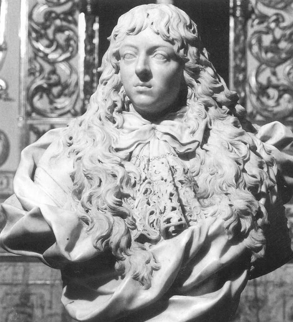
When I studied History of Art in the UK in the late 1960's, it was all about European art, mostly European art produced by men. (Click here for details of influential women artists who contributed to European art history.) https://artuk.org/discover/stories/facing-the-new-century-women-artists-19001909
Art from other cultures was mentioned vaguely but in reference to the influence that it had on Western European artists.
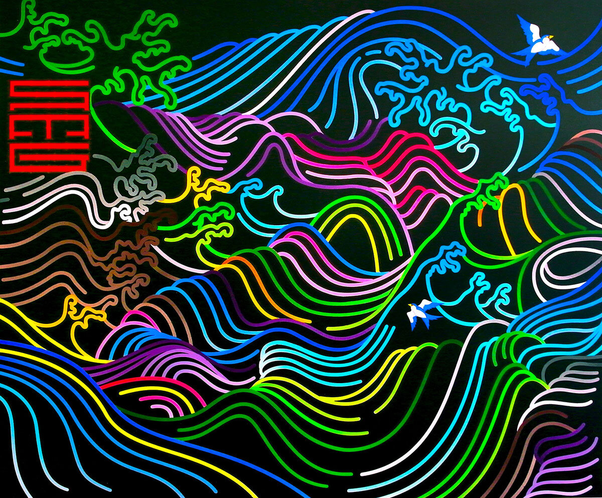
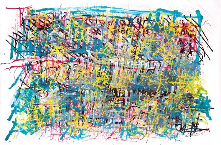
European Art Movements: Classical, Byzantine, Medieval, Gothic, Renaissance, Baroque, Rococo, Neoclassical, Modern, Post Modern, European Contemporary.
The Euro-centric perspective of art history during that time perpetuated a narrative that excluded or marginalized artists from diverse backgrounds. It is important to acknowledge the limitations of the art education I received and to recognize the significant contributions artists from diverse cultures throughout history.
Contemporary scholarship has made significant progress in challenging these historical biases and expanding the narrative of art and art history. Today, we have a greater understanding and appreciation for the various art movements, styles, and artists that were previously overshadowed or omitted.
As we explore the immense range of artistic expressions that exist across cultures and time periods, it is vital to ensure inclusivity and representation. By embracing a wider perspective and giving voice to artists who have been historically overlooked, we can create a more comprehensive and accurate understanding of the artistic landscape.
In our pursuit of knowledge about art, it is necessary to engage with diverse sources, question traditional narratives, and promote a balanced representation of artists from different backgrounds. Through these efforts, we can foster a more inclusive and enriched understanding of art history.
"At some point you become acutely aware of your absence in the whole kinda historical timeline that develops this kinda narrative of mastery."
https://art21.org/watch/extended-play/kerry-james-marshall-on-museums-short/
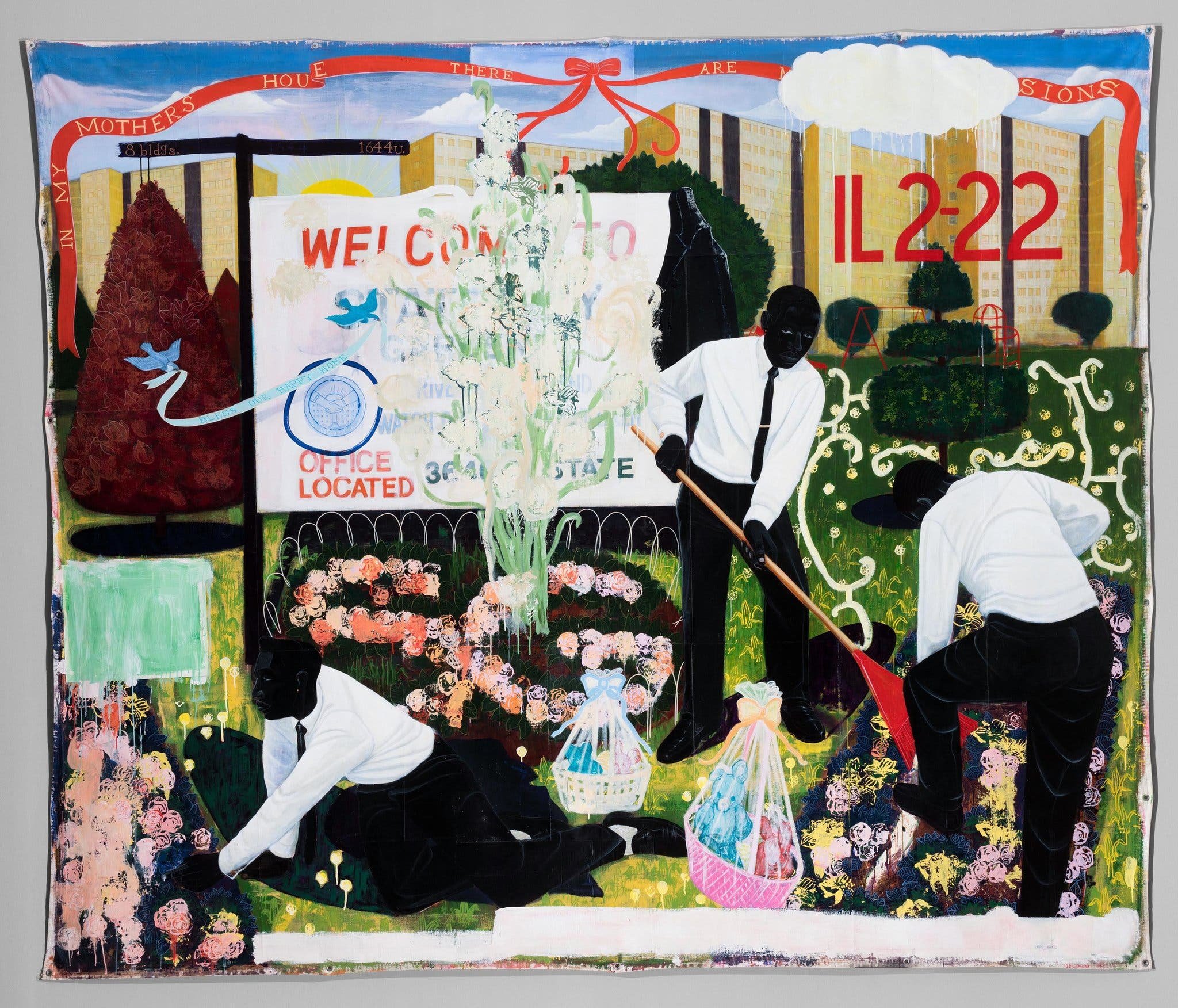
Kerry James Marshall’s “Many Mansions” (1994)
https://art21.org/watch/artist-to-artist/kerry-james-marshall-at-prospect-3/
Creative Growth
“Founded in 1974, Creative Growth is a leader in the field of arts and disabilities, establishing a model for a creative community guided by the principle that art is fundamental to human expression and that all people are entitled to its tools of communication.” Read more about Creative Growth based in San Francisco here: https://creativegrowth.org
“In Spring 2024, SFMOMA will open an exhibition celebrating the 50th anniversary of Creative Growth and featuring a selection from the 114 works by 10 Creative Growth artists acquired by the museum this fall. “ “The San Francisco Museum of Modern Art (SFMOMA) and Oakland-based Creative Growth Art Center announced today an unprecedented partnership that honors the emergence of the art and disability movement in the Bay Area and brings to the fore a critical and often overlooked aspect of the region’s artistic richness. Coinciding with Creative Growth’s 50th anniversary, the partnership encompasses the acquisition of more than 100 works created by artists associated with Creative Growth; the development of two exhibitions with Creative Growth artists; and the presentation of a series of events that will be activated over the course of three years. Additionally, SFMOMA will acquire works from Creative Growth’s two Bay Area peer organizations, with 31 objects from San Francisco-based Creativity Explored and 12 from Richmond-based NIAD (Nurturing Independence through Artistic Development). Together, the acquisitions make SFMOMA home to one of the largest collections of art by artists with disabilities, a historic moment of recognition for a group of artists long underrecognized by the art world.”
Dan Miller
Dan Miller Untitled, (DM 1193), 2019 Courtesy Creative Growth Art Center
More about Dan Miller here: https://www.gateway-magazine.com/articles/the-art-of-dan-miller
Franna Lusson

Franna Lusson Untitled 2023
“Drawing is so important to me. It is a lifeline out of the confusion and anxiety I live with everyday. I started drawing in grammar school but didn’t start working seriously until my late 20’s. Now I mainly draw animals, but have also drawn people, the figure, and portraits. I work in collage and printmaking as well. Usually I start with line, shape and movement using mixed media: charcoal, oil and chalk pastel and oil paint sticks.” https://creativegrowth.org/artists#/franna-lusson/ More about artists who work at Creative Growth: https://creativegrowth.org/artists
Jillian Crochet
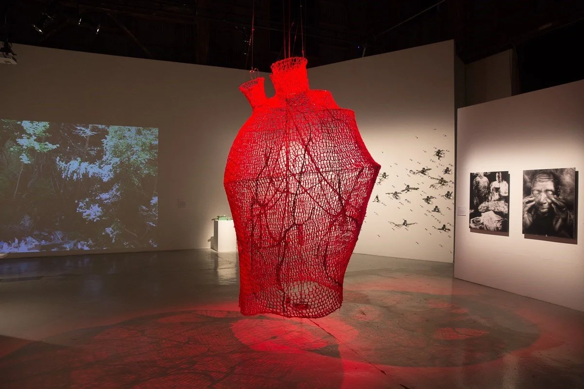
Jillian Crochet My Beating Heart, 2014 SOMArts Cultural Center. Richard Lombiao
More artwork featured in this exhibition: https://www.dazeddigital.com/art-photography/gallery/28483/5/recoding-criptech
Adaptation highlights artists living with disability or chronic illness, whose practice has evolved to facilitate bodily or psychological conditions. https://www.casulapowerhouse.com/casula-powerhouse-exhibitions/past-exhibitions/2020-exhibitions/adaptation
Sharif Persaud

Sharif Persaud Self Portrait, 2015 https://autograph.org.uk/online-image-galleries/identity-and-neurodiversity-the-work-of-sharif-persaud
Art from Asia
Tiffany Chung

Tiffany Chung: 17th Parallel (2010) Courtesy of the artist
More about Tiffany’s work here: https://www.aaa-a.org/programs/presentation-by-tiffany-chung
Sangdon Kim
"Sangdon Kim makes use of a wide range of media and engages with core systems of representation in Korea through materials of everyday life and social relations. In the sculptures on view in the Biennale Hall, he mobilizes elements from Korean shamanism, colonial memory, contemporary politics, and circuits of hyper consumption. According to Kim, shamanistic polytheism and pluralism serve as important modes of understanding the world as they do not refuse the secular but rather pursue the sacred. The outlook of shamanistic faith is rooted in the realization and integration of community and Korea’s indigenous culture. Kim has said that when all of human civilization is in crisis, we are once again bound to turn toward long-standing spiritual cultures based on collective catharsis and reconciliation. The prevailing pandemic, combined with current structures of power, has contributed to deeper class divisions. A unifying approach based on shamanism facilitates the healing of social wounds, mourning, and remorse." https://13thgwangjubiennale.org/artists/sangdon-kim/

Sangdon Kim Kart 2019-2020
Kwon Young Woo (1926–2013)
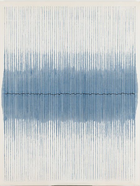
Kwon Young-woo Untitled, 1984 Gouache and ink on Korean mulberry paper
"Trained as an ink painter and part of Munghimhoe (묵림회, Ink Forest Group), Kwon Young-woo made works that disrupt mark-making and gestural abstraction norms. In the 1960s he began exploring the three-dimensional transformation of hanji (“Korean paper”)—confronting the elevated status of painting and the strict division between painting and sculpture. Traditionally, paper was revered as support for ink, but Kwon tore, pasted, and molded it, thrusting it to the forefront.
Working in Paris in the 1980s, Kwon reintroduced ink and color while still emphasizing the paper. Here, gray-blue radiates from the center, darkening vertical slashes as if by capillary action—yet the darkest “line” is a torn horizontal gap. Kwon applied color on the reverse, letting it seep through to the front, a challenge to the glamorized act of paint application.” https://www.metmuseum.org/exhibitions/lineages-korean-art/exhibition-objects
Click here to see Kwon Young-woo talking about his work: https://www.youtube.com/watch?v=z326N9i2pLU
“Joan Kee has written a seminal book entitled Contemporary Korean Art: Tansaekhwa and the Urgency of Method. The book considers Tansaekhwa, one of the most important artistic movements in contemporary art history—yet one that has been significantly over-looked.” https://ocula.com/magazine/conversations/joan-kee/
More about contemporary artists from Asia: https://www.prestigeonline.com/my/lifestyle/art-plus-design/10-of-the-most-famous-asian-contemporary-artists/ https://awarewomenartists.com/en/artiste/dineke-blom/
Nalini Malani
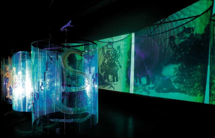
Nalini Malani Transgressions, video/shadow play installation, 2001. https://www.stedelijk.nl/en/exhibitions/nalini-malan More about Nalini Malani’s work here: https://ocula.com/magazine/conversations/nalini-malani/
More contemporary Asian art below https://www.creationcontemporaine-asie.com/en/
Art from the Middle East
From mesmerizing calligraphy to thought-provoking installations, these artists have pushed boundaries and challenged societal norms, shedding light on the complex narratives and diverse experiences of the Middle East. Through their art, they have fostered a dialogue that transcends borders, inviting viewers from all backgrounds to engage with the intricacies of their work. With an ever-evolving art landscape, the Middle East continues to produce exciting and groundbreaking contemporary art for our time.
Radhika-Khimji

Radhika-Khimji Install View 2022 Oman National Pavilion, Arsenale at the Biennale Arte 2022 in Venice. Photo credit: Thierry Bal. Images courtesy of Experimenter.
“I read some post-colonial theory while I was studying in University that really shaped my ideas about hybridity and identity in our world today. It made me question how I could talk about identity in my work without it becoming a formula for an artist of Indo-Omani ancestry working in the UK. It’s been a challenge to navigate these sticky points of loaded traditions, and not make them the central, easily digestible points of interest in my practice. I feel I consciously keep the registers and terms in flux to prevent any possessive and fixed interpretation. I am interested when the work can evade these terms, and somehow subvert a cultural reading of the work.”
Click here to see more work in the Oman National Pavilion at the Biennale Arte Venice by Radhika-Khimji: https://south-south.art/biennale/radhika-khimji-at-venice/
Larry Abramson

Larry Abramson Gafno XLIII, 2020 oil and acrylic on paper More work by Larry Abramson here: https://www.gordongallery.co.il/now-artist/larry-abramson https://en.wikipedia.org/wiki/Larry_Abramson
Canan Tolon

Canan Tolon Alidade, 1993
More about Canan Tolon’s work here: https://www.artsy.net/artwork/canan-tolon-alidade
More Turkish Artists below: http://www.naturadergi.com/haberler/sanatci-burcu-percin-ile-soylesi/?lang=en. https://www.widewalls.ch/magazine/contemporary-turkish-artists/gulay-semercioglu https://theculturetrip.com/europe/turkey/articles/10-best-turkish-artists-and-where-to-find-them
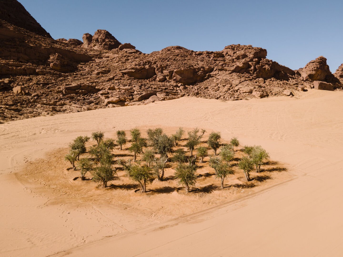
khalil Rabah’s exhibit at Desert X AlUla 2022
More information and artists. Desert X AlUla here: https://ocula.com/magazine/photologs/desert-x-alula-2022/ https://whitewall.art/art/khalil-rabah-is-examining-the-human-condition-through-art-and-community/ https://thethirdline.com/artists/33-farhad-moshiri/ https://www.riseart.com/guide/2459/contemporary-middle-eastern-artists-to-know-about
First nation American art
Jeffrey Gibson
Jeffrey Gibson Infinite Indigenous queer love 2021
“For the fringe cubes, I remember thinking it’s like taking the person who has always been in a supporting role and then making them the star,” Gibson said. “How do we take something like fringe that I’ve seen in this context in one particular way–usually on shawls and moving through the air, which is beautiful–but I’m like, what’s the difference?”
The fringe, typically a feature of Indigenous dance regalia, continues Gibson’s habit of combining elements from traditional Native American art with contemporary artistic references. To find out more about Jeffrey Gibson’s work click here: https://bostonartreview.com/reviews/issue-07-jeffrey-gibson-mary-mcneil/#:~:text=Paper%2C%20paint%2C%20and%20beads.,opening%20of%20his%20solo%20exhibition.
Emmi Whitehorse

Emmi Whitehorse Jackstraw, 2000. Lithograph on paper
Through her artworks, Whitehorse represents the Navajo philosophy of Hózhó, which refers to the interconnectedness of harmony, beauty, wellness, and order. Hózhó guides and informs Whitehorse’s abstract paintings as she explores the balance between paint, pastel, and graphite to tell the story of the connection between land and life. “My work is about and has always been about land, about being aware of our surroundings and appreciating the beauty of nature. I am concerned that we are no longer aware of those,” https://nmwa.org/blog/5-fast-facts/5-fast-facts-emmi-whitehorse/
Susan Point

Susan Point Flight (1995) the world’s largest spindle whorl, at Vancouver International Airport Spindle Whorls were historically used by the Coast Salish people to spin wool.
"Right from the beginning, I pushed the boundaries of Coast Salish imagery in my own personal art style, creating original designs, but always incorporating stylized Salish elements within every piece. While my work is rooted in Coast Salish traditional art, I create my contemporary works so that anyone, at any age, can relate to my imagery and form their own opinions, assumptions or interpretations. We, as Salish people, continue to evolve. We are rooted in our history, yet facing the future. As an artist, I love the challenge of creating art that works in any medium." https://www.gallery.ca/magazine/artists/an-interview-with-susan-point
Bill Reid

Bill Reid The Raven and the First Men 1980
“This massive piece of laminated yellow cedar, set in its own alcove at the UBC Museum of Anthropology, is a burnished amber beacon of artistry and meaning. It depicts the ancient Haida oral story about Raven encountering a large clamshell on a beach in Haida Gwaii, in the Haida homeland along the North Pacific Rim. Intrigued by a commotion emanating from inside, Raven opens the shell and finds a group of humans clamoring to get out.
In most North Pacific indigenous cultures, Raven is the “trickster,” a querulous, ever-busy instigator of change and turmoil. In this case, he opened the shell not just out of curiosity but as part of his innate role as a catalyst. Several timid proto-humans peered out, then clambered from shell to beach. And so began the history of the Haida people. Reid’s interpretation of this origin story is a mesmerizing work of art whose power and beauty surpass every sculpture I’ve ever seen.” https://discover.silversea.com/destinations/alaska/vancouver-artist-bill-reid/
More First nation American art here: https://www.artsy.net/article/artsy-editorial-11-influential-native-american-artists https://artuk.org/discover/stories/highlighting-modern-indigenous-art-of-north-america https://www.artspace.com/magazine/art_101/in_focus/contemporary-native-american-artists-challenging-the-way-we-look-at-american-history-55116 http://www.matikawilbur.com
Art from South America
South American art encapsulates a rich tapestry of cultural expression, an intricate fusion of history, indigenous traditions, and artistic innovation. From the vibrant colors of the Amazon rainforest to the mystical allure of the Andes mountains, South American art offers a captivating journey into the diverse landscapes and complex narratives of this continent. Each brushstroke and sculpture carries within it a profound connection to the spirit of the land, mirroring the people's deep-rooted connection to nature and their ancestral heritage. With influences from Pre-Columbian civilizations, colonialism, and modern reinterpretations, South American art not only reflects the past but also acts as a dynamic lens through which contemporary issues and identities are explored. The art of South America is multifaceted, with a myriad of styles, techniques, and mediums employed by its talented artists. From the vibrant murals found in the streets of Valparaíso to the intricate weavings of the Quechua women, South American art is a testament to the region's creative spirit and human resilience. Through this artform, we are invited to celebrate the cultural diversity and profound history that defines the South American continent.
Rosângela Rennó

Rosângela Rennó Wedding landscape 1996
“I usually say that my interest lies in the humanities, in history and its erasures, and in the history of photography itself, its social uses and functions. All of this begins with an immersion into the images themselves, in collections I find in Brazil and abroad. My work process resembles a researcher’s, because my involvement with a specific set of images requires investigating their origins, their fate, and the reasons for their existence. Mostly, I am interested in collections that were destined to oblivion or destruction, such as in badly classified or stored archives, or archives that come up for sale in flea markets or are found in the trash. The discarded image takes on an “anonymous” quality, though of course it was made by someone. Beyond this, the discarded image has much to reveal, perhaps even more than one that has been classified. In looking for the reasons these images have been abandoned, I believe I am better able to understand their existence and connect them to some form of humanity through their political, ethical, or aesthetic aspects.” https://www.moma.org/magazine/articles/769
More work by Rosângela Rennó: https://revuecaptures.org/contrepoint/experiência-de-cinema
Denilson Baniwa
“Sometimes the challenge is not to occupy positions. When the existing ones don't work, it is necessary to create something new. Denilson Baniwa is an indigenous artist; he is indigenous and he is an artist, and his being indigenous leads him to invent other ways of making art, where processes of imagining and making are, by force, interventions in a historical dynamic - the history of the colonization of indigenous territories that we know today as Brazil - and interpellations to those who find him to embrace their responsibilities.”
https://www.agentilcarioca.com.br/en/artists/111-denilson-baniwa/

Denilson Baniwa Natureza Morta (2) 2017
https://www.youtube.com/watch?v=kqmmEV2ED_g https://www.digitalbrazilproject.com/denilson-baniw.
More Contemporary Latin American artists below: https://www.spanish.academy/blog/10-innovative-contemporary-latin-american-artists-who-broke-the-mold/
Art from Africa
Batoul S’Himi

Batoul S’Himi Untitled, from the series “World Under Pressure,” 2011,
More about the work of Batoul S’Himi here: http://islamicartsmagazine.com/magazine/view/batoul_shimi_world_under_pressure/
Yatreda
“As a family of artists based in Addis Ababa, part of Yatreda motivation is to create and preserve the traditions of Ethiopian culture on the blockchain by making art in the style of tizita- nostalgia and longing for the past.” https://www.thisispaper.com/mag/kingdoms-of-ethiopia-yatreda
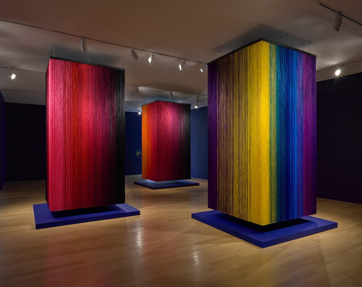
El Anatsui
El Anatsui Behind the Red Moon, installation view, Tate Modern, London, UK. Photo: Joe Humphrys.
“In his 50-year-long career dedicated to sculpture, El Anatsui has worked with wood, ceramics, and metal. With a preference for materials sourced locally, he repurposes used, broken, or discarded objects, emphasizing their transformation from purely functional items to contemplation pieces.
The artist’s philosophy of always working with what’s around him and cheap, widely available materials led to experimentation with parts of metal tins. His famous use of liquor bottle caps goes back to the late 1990s when he found a bag filled with them lying around his studio. Anatsui then started to sew the flattened caps together with copper wire, creating sheets of lightweight, colorful, and malleable metal.
For the Turbine Hall installation, these immense panels of metal hang from the ceiling, forming abstract compositions that change according to light and offering a dazzling experience for visitors.” https://www.dailyartmagazine.com/el-anatsuis-turbine-hall-commission/
El Anatsui’s talks about his work here: https://www.youtube.com/watch?v=zguexoZcV7U
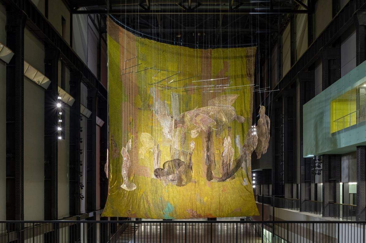
Michael Armitage
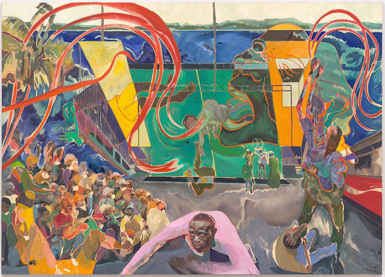
Michael Armitage Curfew (Likoni March 27 2020)2022
“As you try to figure out what’s going on, you pick up on crowds and mayhem. In the immediate foreground, a man in a pink shirt looks to be in a state of mortal desperation. Something terrible is taking place.” https://www.washingtonpost.com/arts-entertainment/interactive/2023/michael-armitage-curfew/
Michael Armitage talks about his work here: https://www.youtube.com/watch?v=_hOxyPTisRw
More African art here: https://www.africancontemporary.com/paintings.htm
Oceana Click below to find out about this geographical area
Art from Australia
Fabian Brown

Fabian Brown working at the Tennant Creek Brio
“In Warumungu country in the Northern Territory there is a collective of male Aboriginal artists who call themselves the Tennant Creek Brio.”
“We make the new and the old cross over. Joseph comes up with poems, and writes stories. We’re making our stories strong, about where we come from. We collaborate in our collective. Fabian can do a nice story painting and Joseph can do a poem on it, and then the culture stuff I might come in with— whether it’s traditional dancing, or a boomerang or a spear that represents our traditional culture. Or even a video. Because we live in a new world today, our old culture is adapting to contemporary times, and sits side by side and hand in hand to go forward.” https://artguide.com.au/tennant-creek-brio/
More here showing different artists working in a variety of styles: https://www.youtube.com/watch?v=d0WfqQAbV0o
“Billboards of contemporary works and archival images intended to illuminate First Nations’ perspectives of place in north Queensland”. https://www.theguardian.com/australia-news/2021/aug/07/itll-certainly-intrigue-people-roadside-art-tells-hard-truths-about-indigenous-history

Rosalie Gascoigne 1917-1999
Rosalie Gascoigne Piece to Walk Around 1981 “How can I show you the land I walk? You, who stands on pavements,
Have never seen the wide place I know.” https://goulburnregionalartgallery.com.au/exhibitions/rosalie-gascoigne
Bio and more work by Rosalie Gascoigne: https://ocula.com/artists/rosalie-gascoigne/
More artworks by Australian artists: https://www.widewalls.ch/magazine/australian-contemporary-artists
John Pule

John Pule Savage island hiapo 2008 “Throughout his career, John Pule has developed his own language of motifs and figurative elements anchored in the history and mythology of his birthplace Niue, an island country in the South Pacific.” https://artcollector.net.au/john-pule-time-will-tell/
Matt Arbuckle

Matt Arbuckle All the more afraid 2019
“Arbuckle’s practice is a process-driven exploration of place, representing landscapes that are conceptualised through their very making. Through an experimental practice that favours process over outcome, Arbuckle uses elements of traditional Japanese shibori dying techniques to create abstract compositions by wrapping, twisting, folding and draping fabric over found surfaces and structures. The resulting paintings use depth and movement to trace and reveal abstract memories, imprinting the experience of place into the artwork. Matt Arbuckle is represented by Two Rooms, Auckland; Daine Singer, Melbourne” http://www.mattarbuckle.com/new-page
Maile Andrade

Maile Andrade (Kanaka ʻŌiwi) Ka ʻŌpua Hina/ The clouds of Hina, 2019. “The cultural bearers of kapamaking are few compared to the needs of kapa in ceremony, burials of iwi (bones) of our ancestors and in cultural practices.” https://www.nativeartsandcultures.org/maile-andrade
More about artists from the Pacific: https://theculturetrip.com/pacific/articles/top-10-incredible-contemporary-artists-from-the-pacific-islands
Inuit art
Qaumajuq art gallery Winnipeg Canada

Qaumajuq is a new art gallery, home of the largest public collection of contemporary Inuit art in the world and part of the Winnipeg Art Gallery.
Shipping containers dot the landscape of many northern communities, but in a downtown art gallery, it was an unexpected touch in a new exhibition space.
When Qaumajuq at the Winnipeg Art Gallery unveiled INUA, its inaugural show for Inuit artists in early 2021, a full-size, red shipping container, doors open, was placed in the centre of the room.
It’s not what you think of when Inuit artwork comes to mind. And yet, it was perfect for the occasion.
Qaumajuq is a first-of-its-kind gallery for Inuit art and culture in the heart of downtown Winnipeg. The large-scale installation commissioned for the exhibit was created by Glenn Gear, a multi-disciplinary artist and filmmaker of mixed Inuit-Settler ancestry from Corner Brook, Newfoundland and Labrador.
“That container really is a container for so many of my thoughts and wishes about Labrador, about culture and about my place within it,” Gear said. “It’s very much a space of reflection, but also it’s a love letter to Labrador.” By Megan Robinson & Dawna Friesen Global News Published April 1, 2023. https://globalnews.ca/news/9590246/quamajuq-inuit-art-future/
Shuvinai Ashoona

Shuvinai Ashoona Help Us (2022) Installation view REPRODUCED WITH PERMISSION DORSET FINE ARTS COURTESY MARION SCOTT GALLERY © THE ARTIST
More about this artist and others here: https://www.inuitartfoundation.org/iaq-online/inuit-artists-to-watch-for-at-art-toronto